Tia's Jewelry Mobile Shopping Experience
This project was for my UX/ UI Design course with Coursera. The objective of this particular project was to create a hi- fidelity prototype for a mobile app that is easily accessible for the user. This is my first case study that i have created through the Google Coursera Course. I Have learned a lot about UX/UI design While Creating this app.
Tools Used: Figma , Canva, sketch pen and paper
.png)
Tia's Jewelry
This project was to create an app for a jewelry designer. The goal for this project was to create an app that allows the user to find their favorite accessories with ease.
My role during this process was the lead UX designer and researcher. I took on the responsibilities of wire-framing, prototyping, and a user research study.
ROLE: A solo comprehensive design Project
TOOLS: Figma, Canva
TYPE: IOS Application, Personal Project
PURPOSE:
On a daily basis there are many people that shop online, especially for accessories. When Big events come up last min, it is sometimes hard for people to find the ideal jewelry item in time. Most people spend hours looking for the Ideal Jewelry item for an outfit or any kind of upcoming event.
As a result the purpose of my mobile app is to optimize the shopping experience by providing features that helps the user find the items that they need with ease.

Understanding the User
The user research that I conducted was designed to see if I can find fast and efficient ways for the user to be able to find the jewelry item that they need. I conducted a moderated research that was remote followed by a length of prompts to be followed.
One of the assumptions that I made going into the research was that I didn't think that there were going to my many issues with my low- fidelity prototype. My assumptions changed in having to pay attention to accessibility features for everybody.

Jacob, 32 yrs
"I like to present myself well in meetings by making sure I look sharp."
Frustrations + Goals
-
"I want to be able to find jewelry items easy through features such as filters."

Kim, 25 yrs
"I love shopping online for clothes and accessories, but i do get overwhelmed when i cant find what I'm looking for in enough time."
Frustrations + Goals
-
"I have trouble finding specific jewelry items because of the lack of categorizing and filters."
Affinity Diagram
After conducting the usability research an affinity diagram was created. I created an affinity diagram to help organize some of the insights that I received during the user research process.

We have all had these problems before - having trouble with finding what we need in an efficient amount of time. For us to work to find a solution for these problems, we need to contact frequent online shoppers one by one.
So the question is: How might we devise a way for the user flow to move along with ease?
What can we learn from the users?
Starting the Design
Paper Wireframes
When drawing out my wireframes i wanted to illustrate designs that would create an easy user flow.I wanted to create a flow where the target user could access different features to make their shopping experience a little easier.


Digital Wireframes
I wanted to have easy accessibility to new sales and featured items. I also wanted there to be an easy way to answer commonly asked questions


I included different types of ways for the user to access different categories of jewelry.
Usability Study
Once the digital wireframes were completed, I conducted a usability study. I gathered target users to test the low fidelity prototype that I created.
Link to Low- Fidelity Prototype

So What Did We Find?

Some of the older participants had trouble finding the filter tab
Some of the users did not like when they found two items in their cart when they only added one item.
users found the checkout process a very easy process
some users did find a filter feature pretty useful.
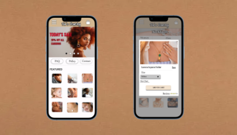
Mockups
After usability testing was conducted, I worked on refining my wireframes from the low-fidelity prototype. I created mockups to show the final look of what the hi-fidelity prototype would look like.


Hi- Fidelity Prototype