
My challenge was to create and build a design system for my client Jeghetto's Entertainment new upcoming app. I designed a system where the clients supporters can have easy access to his content, merchandise and up coming tour dates. My client asked for a black and white styled app that can feature his new comic book through the designs.
I was responsible for the designs, wire-framing, prototyping, and user testing
tools used: Figma, Canva
JEGHETTO'S ENTERTAINMENT
The Challenge

PERSONAS


Based on the project, we set up 2 user personas. We referred them throughout the entire product development process.
-
Personas help to create realistic representation of the target audience.
-
To create our user personas we provided information such as motivations, pain points, and a biography.
-
In the Design I wanted to make sure the pain points were addressed. I added features where there are ways to see upcoming events, and ways to be able to book a show.
-
During the user Flow stage was where I most looked back at the created personas.
USER JOURNEY
I mapped out a flow of steps that the user would take to figure out the most simple way to reach their important goals.

I choose to display the user flow of checking out a merchandise item
PAPER WIREFRAMES

I start the design process with paper wireframes. I used the crazy 8 method when creating my paper wireframes
-
The main purpose of starting with paper wireframes is for brainstorming purposes.
-
The client wanted his work showcased throughout the app.
-
the client wanted to convert his website into an app. Since the website was very cluttered. I categorized the clients content so the user can access the app easily.
-
The sketches helped me to move forward, because i had a solid foundation of my ideas for the design.
DIGITAL WIREFRAMES
I created digital wireframes to further display my ideas for the designs of the app.
-
creating digital wireframes helps to get a better understanding of how the foundation of the design would look digitally.
-
I used Figma to create this digital wireframe.
-
Because of the timing that i had to finish the designs, testing was not able to be done until high mock-up designs were done.


LOW- FIDELITY PROTOTYPE

Click image to view low- fidelity prototype
USER TESTING
Before launching the product, I did a testing round in order to reveal possibility usability problems.
-
The goal was to find ways to make the user journey smoothly for the user. Another goal was to also find any errors that users can come across.
-
I choose 5 test subjects who that I thought would best fit the targeted user for my clients app.
-
The ages of the test subjects ranged from 21-55
-
The testing was conducted remotely over zoom. The tests were also moderated
THE DESIGN
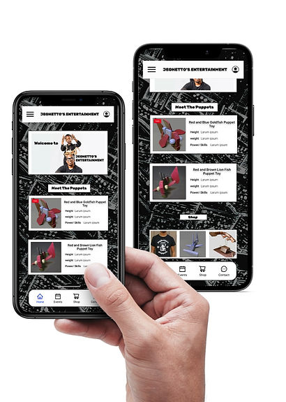
Once I tested out all usability mistakes, I started designing the final screens in Figma
-
The visual design that I decided to follow was a dark and urban comic look.
-
My client requested a comic book style with only black and white colors. With my clients request, I used his comic book pages for the background of the app pages. I also used fonts that are similar to a graffiti comic look.
-
This design was designed for IOS apps, and soon will be adjusted for androids as well.
-
The design is very simple. The lower navigation tab allows users to easily access the main user flows such as, the home page, events page, and the shop page.

LEARNED
This project was my first freelance project, so it was very exciting for me to have this experience.
Ive learned a lot while working on this app such as time management with how i took the time to design the app in Figma.
While starting this project, I was very nervous because i had full control of the designs and the user flow off the app. Thankfully my mentor was there to guide me if I had any questions. I over came my fears taking deep breaths, and doing my tasks one step at a time.